 LIBERTY, 2025, wood and collaged paper
I first met Al Diaz over a decade ago when I was gathering oral histories of the 70s/80s downtown art scene. Obama was still president, and X wasn’t even yet a twinkle in Elon Musk’s eye. I wanted to ask Al about his days with his teenaged friend Jean-Michel, co-author/conspirator in the works of SAMO©, the street tag known for such pre-internet proto-memes as SAMO© . . . 4 THE SO-CALLED AVANT-GARDE and SAMO© . . . 4 MASS MEDIA MINDWASH.
Swept by the sensationalism around enfant terrible Basquiat from the lips of SoHo gallerists reading the writing on the walls of the Lower East Side, SAMO© was soon appropriated by the blue-chip gallery system it criticized, where it was rapidly becoming fashionable to stuff excess wealth with nowhere else to go into art made by those young, crowned celebrity-artists.
I was drawn, admittedly without specific aims, to this time and place in the course of interviewing artists for zing, when I noticed that among the 70s/80s downtown set—those who survived the 80s—there was a real flair for storytelling and that people from this time really were (and many of them, still are) characters, and in this way, Al is the same. He’s got the aura of someone who would be right at home in a Scorsese movie.
“We weren’t ‘making street art’ we were writing graffiti,” he said when I interviewed him that first time, drawing out the words to emphasize making and art. I immediately decided I liked him and wanted to know his story, suspecting that because it wasn’t over, hadn’t really been told, it might be the more interesting one.
Frozen in time at the height of his late celebrity, Basquiat was genuinely tormented by early trauma that made the art as raw and soulful as it made the artist painfully difficult at times with those whom he called friend. These painful off-and-on friendships with other highly creative people, Al early among them, were interwoven in the creative process of art-as-lifestyle and life-as-art that made Basquiat so charismatic, painting barefoot in an Armani suit.
In January 2017, Al came over to my apartment in Ridgewood with a mutual friend, to have coffee and talk about the impending inauguration of Trump. We were talking about how the election had been basically a Twitter prank that wouldn’t end, and then Al said that he was bringing SAMO© back.
Ironically, the unreleased Basquiat biopic Samo Lives, reportedly did not include the still living half of SAMO© in the process of the film’s production. Reinvigorating the same old buzz also provoked legal battles over copyright ownership in addition to threatening accuracy and preservation of the creative legacy.
In January 2026, now a full-time artist, dozens of gallery shows, two books, one arrest and a midnight sun later, looking around Al’s Sunset Park studio, the same hand that wrote SAMO© graffiti is undeniable everywhere. Distinct from the shared tag but nonetheless bluntly political and deliriously irreverent. Frenzied color and American iconography. Al is not an ‘activist’ artist but there is that quality of something insistent, urgent, and urban coming from the canvasses of recent paintings and artworks.
Al Diaz as Interviewed by Rachel Dalamangas
You’ve said you returned to an art career after Trump was elected in 2016. Your political positions have been remarkably consistent over the years. How does politics animate your work—structurally, not just thematically?
I returned to writing SAMO© graffiti in 2016. I had already been creating the WET PAINT/ Subway sign series for about five years, but the constraints of a 22-character alphabet were too much for articulating what I was feeling. At the same time, I had grown tired of hearing the cut and paste, remix story of SAMO© being JMB’s nickname so I set out to rectify the warped narrative. It was time that I give actual examples of actual SAMO© graffiti for an entire generation who had missed out on it, they would be mostly all new (updated for the 21st century) and true to the original format (AS AN END 2- AS AN ALTERNATIVE 2 etc.) Around this time I was playing with bringing the WET PAINT/ Subway sign series to life by mixing the text with imagery and color etc. This would be the direction I took as a visual artist.
FLOWERS GROW, 2024, mixed media on canvas
When you brought SAMO© back, what were some of the reactions you got?
Here’s a story. I got in some trouble, but it was funny. Did you hear about that?
I got in real trouble when I was writing SAMO© graffiti at the Prospect (Avenue) station. This woman at MTA said something and then there was a warrant out for my arrest. I had to get a criminal lawyer, which cost me like three grand.
I showed up at 5:30 or 6:00 in the morning to the precinct, right here in Sunset Park. They cuffed me, they took me in a fucking patrol car down to Central Booking. Put me in the system, gave me my own cell. I was like 60 years old and I’m like fucking locked up. I haven’t been in jail since I was using drugs, you know? Eight hours I’m waiting. That’s how long it takes. About 4:00 I get to see the judge. Like a week before I had been aware of the fact that I had to go give myself up, they had given me an award, it was the borough president and the mayor’s office, had given me an award for contributions to street culture for the same fucking thing that I’m getting arrested for.
So, my lawyer, he goes up and argues my case. They’re all friends, right? They go to lunch together. I walked out scot-free, nothing. They say ‘stay out of trouble and we’ll expunge it in six months. It’ll disappear,’ which I’m sure it has.
Somebody got wind of it, and they told somebody about it and their writer friend works for the Wall Street Journal, and they did an interview about the whole thing. I got an article in the fucking Wall Street Journal over this thing.
I mean, it’s absurd that you get arrested for what you get an award for.
So SAMO© became international. I had to stay in Iceland for a night ‘cuz we missed our flight and I did some SAMO©s, like I put a sticker on a sign at the airport parking lot and these kids that were following me on Instagram, they DM me, “Oh, you’re here?” And they came and they picked me up. It’s like plain daylight, right? But it’s 2:00 in the morning, June. Midnight sun. And these guys show up at 2:00 in the morning and they took me to the Blue Lagoon.
I mean just all this great stuff happened because of the same old thing, you know, the same old fame.
That would not have become so famous had it not been for Basquiat’s involvement.
But I wonder what Basquiat would have been without SAMO©. If you had never done SAMO© and made art with Jean-Michel so early, how do you think you would have developed as an artist?
I don’t do the HYPOTHETICAL thing all too easily but I think my career would have taken a very different trajectory had SAMO© and JMB never existed for me. First of all, SAMO© became a career move only as a result of it becoming so widely embraced. I can only speak for myself, but I did not think of any artistic endeavors at that time as a step towards anything greater. The idea of a CAREER was non-existent. I imagine that I would have still naturally grown interested in music/percussion and possibly even the making of percussion instruments. I don’t think that part of my history was at all influenced by the SAMO© project. Maybe I would have followed my younger wishes of drawing and writing my own comics (?) As for fine/visual art, it is hard to say what might have developed.
The artist’s Sunset Park studio, 2026
As he shows me around his studio he is rummaging through shelves of homemade instruments, materials, and books. He has a basket overflowing with strips of MTA wayfinding slats. He shows me a Middle Eastern doumbek and a ‘super primitive crazy instrument’ called a berimbau.
Here’s this insane thing I made. It’s funny.
From a shelf, he produces a small homemade instrument made of a colorful square tin bound to a stick. He starts tapping it with a mallet, causing the tin to pop off.
I guess it’s been sitting there for a while but it’s this insane instrument. I made it from like a Trader Joe’s fucking smoked paprika thing. That’s the resonator. It sounded a lot better before. I think it got some heat. Anyway, I don’t have a name for that.
The artist in his studio with a homemade instrument, 2026
We were talking recently about the creative need for an audience—the desire to be saying something to someone—and how the raw pursuit of fame can warp the ego can warp the art. What did you learn from watching people take off that young?
I saw very young and presumably confident, conscious and certainly talented people being what I imagine was RUSHED into the limelight and public focus. In some cases, for more than just their art. The hype machine was running full throttle. That was good for some people’s careers, but I believe that a young ego is very impressionable and fragile. Too much, too soon, too early can have negative results. Burnt out, jaded and cynical before one has truly FOUND their VOICE. Only a few of the art-stars from the 80s explosion have survived to enjoy their success.
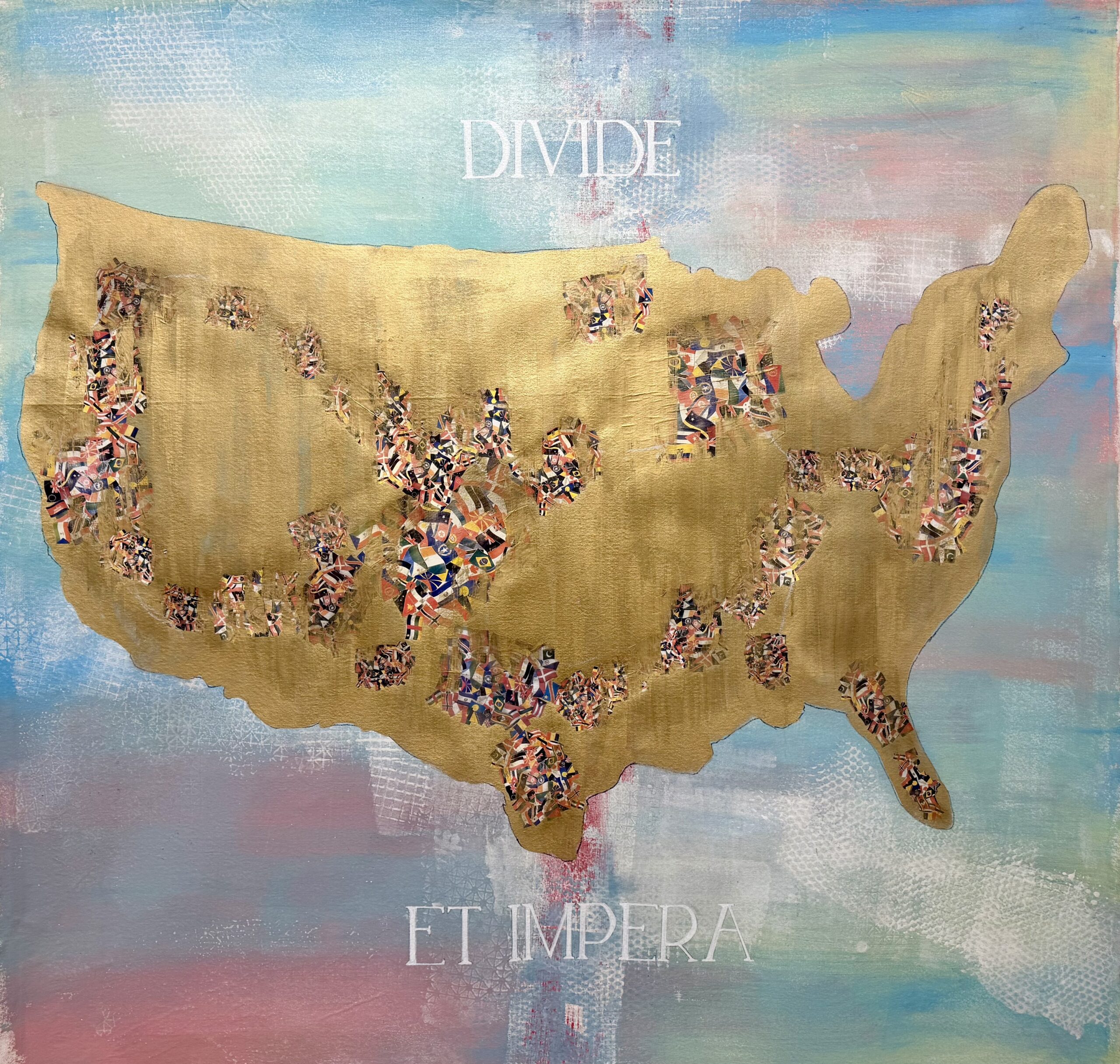
DIVIDE ET IMPERA, 2025, mixed media on canvas
What do you think art’s place is in a time like this one?
I think it’s like Nina Simone said that an artist has to reflect their time or their circumstance. Not every artist does that. Not every artist feels compelled to do that. But I do. I think it’s part of just how I grew up.
When I was talking about the 80s and how an artist had to have a product or something, I was raised in a working-class family. You have certain values you know? It’s harder, or you got to make more of an effort. You can’t be frivolous and like phony or whatever when you’re from a working-class kind of environment. A person like that doesn’t feel comfortable putting on an air or to pretend, it’s just absolutely unnatural.
Art doesn’t save the world though.
No, it doesn’t save the world, but it makes life better you know.
Well, I shouldn’t say it doesn’t save the world because evolutionarily it’s sort of an accidental byproduct of our ability to make tools.
And our ability to think and to create. To imagine and to do all the stuff that separates us from animals. I don’t know. I mean, apes can make tools, too. So, I’m not going to compare it to apes, but certain creatures don’t have those abilities. I don’t think a turtle would be able to make art. Nothing against turtles.
Anyway, I think it’s admirable when an artist shares some kind of message, be it hope or anger. Something that makes people think and can make people not feel so helpless. If you can give somebody some kind of hope in the sense of giving strength, as opposed to hopelessness.
I mean authoritarianism depends on the cynicism of the people.
Right, or people giving up and of course that’s what [authoritarian leaders] want. So, if you do that you‘re like just contributing to the downfall of human independence and human dignity.
It’s no secret that trust funds and proximity to power do much for the pursuit of a creative career. But not having these things doesn’t stop people—nor should it—from making careers as artists, even if it’s harder. As someone who really did play the long game, what is your advice to young artists today?
To young artists, particularly those who come from less privileged backgrounds. You need to realize early on that being an artist is not so much a career as it is a lifestyle. You need to surround yourself with others who have similar aspirations as well as those who do not understand anything about art. Go see as much art as you can stomach. Avoid being a KNOW-IT-ALL (life will humble you) Stay TEACHABLE. Seek adventure and absorb knowledge at every opportunity. Apply all experience to your creative process. Enjoy food, music, laughter and companionship. To quote Patti Smith “Take care of your teeth!!” And lastly
Love fiercely and allow others to love you.
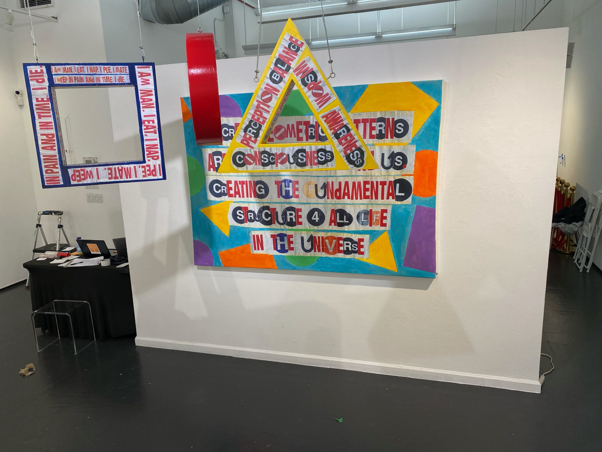
SACRED GEOMETRY, 2023, wood and hand embellished digital print on canvas
What are you working on right now?
I am working on a series of larger mixed media works (60” x 60”) specifically for a proposed show in Paris this May (fingers crossed). But I am always doing smaller projects like print editions and my own text postings on a daily basis.
Rachel Dalamangas
New York, New York
2026
All photos courtesy of the artist.